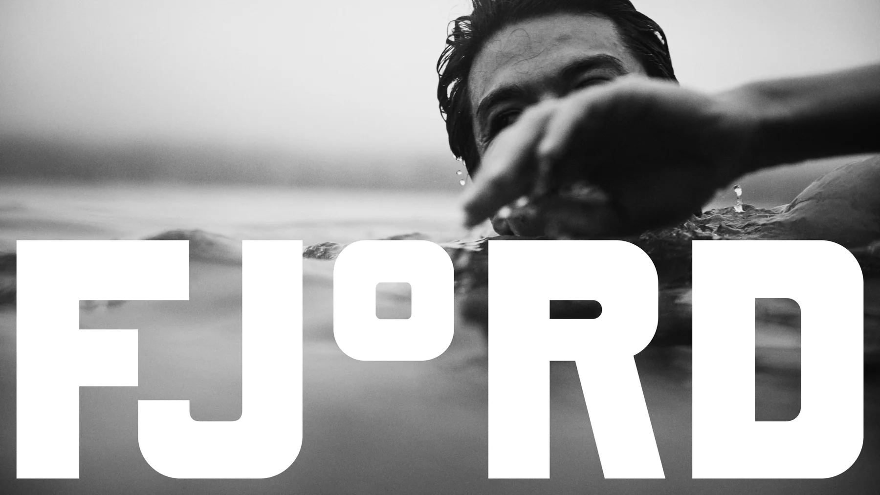
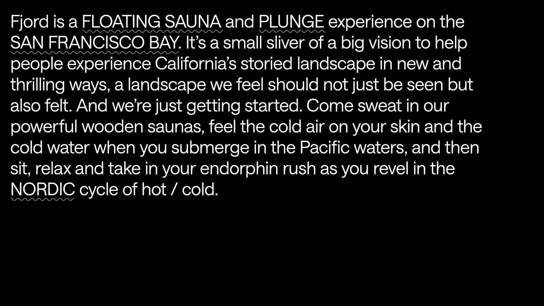
Fjord 是一座漂在旧金山湾上的桑拿和冷水池,位置在索萨利托一带。创始人 Alex 和 Gabe 给它的定位是:Fjord 不是水疗馆,也不卖水疗服务。它提供的是一种公共的、户外的、自助的体验,蒸完、泡完冷水,和朋友喝一杯。
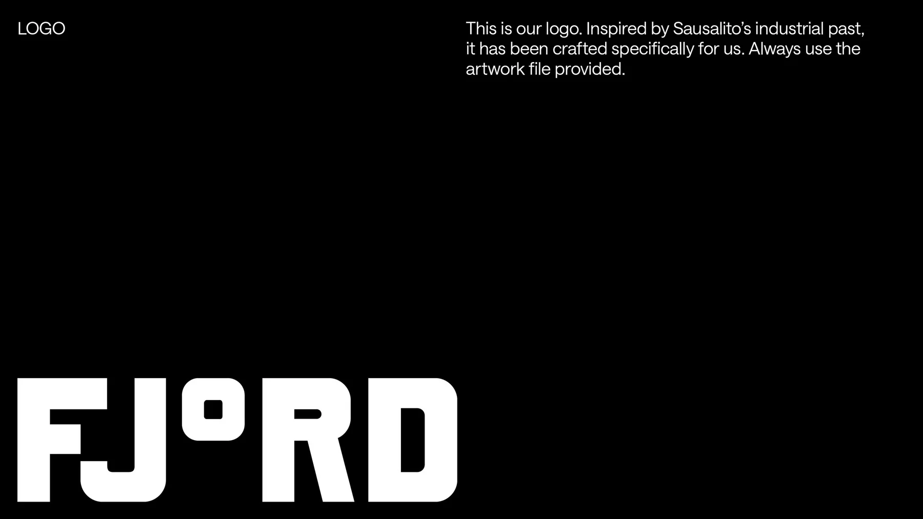
伦敦的 DutchScot 为它做了全套识别,范围包括标志、印刷品、网站、周边和导视。工作室给自己定的要求是绕开桑拿和水疗品牌的老套路,灵感改从索萨利托的工业往事里找。
把 O 换成度数
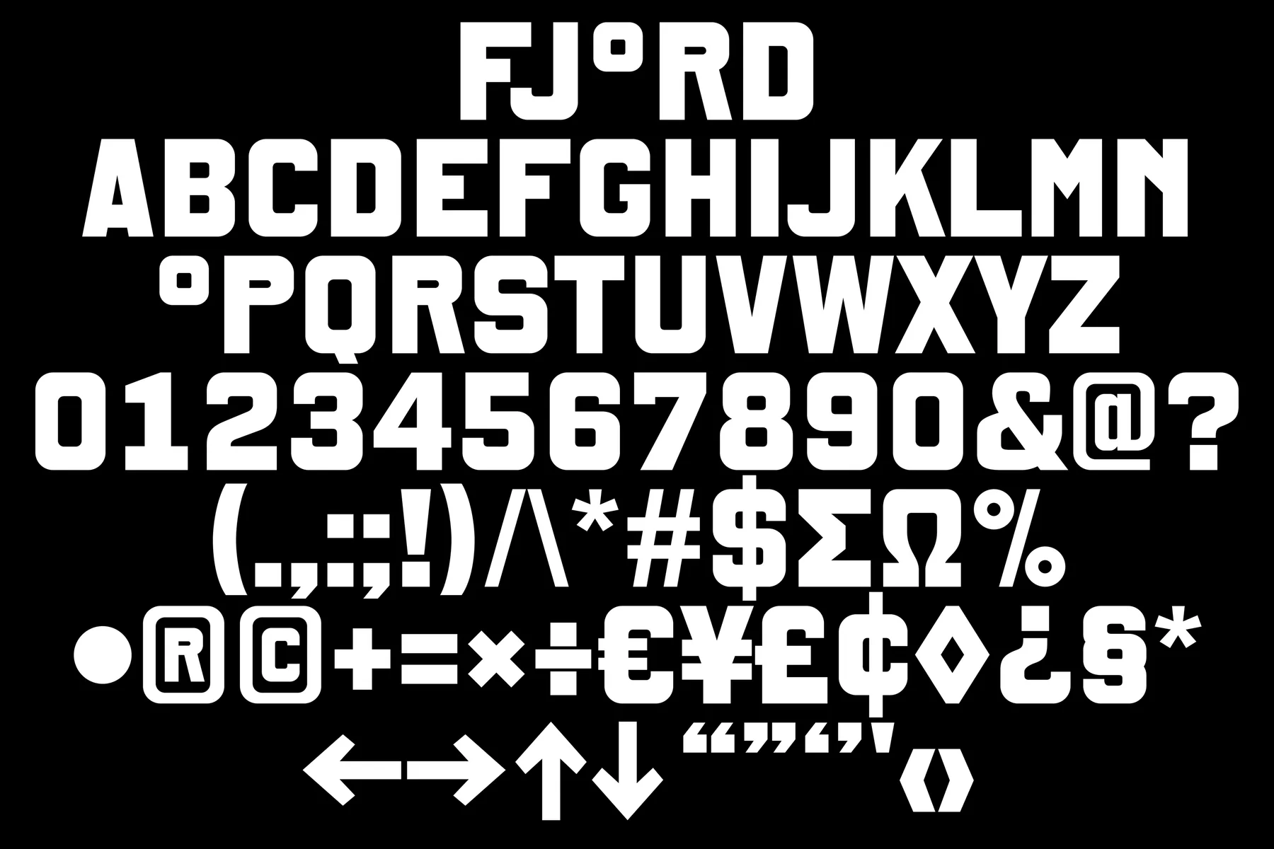
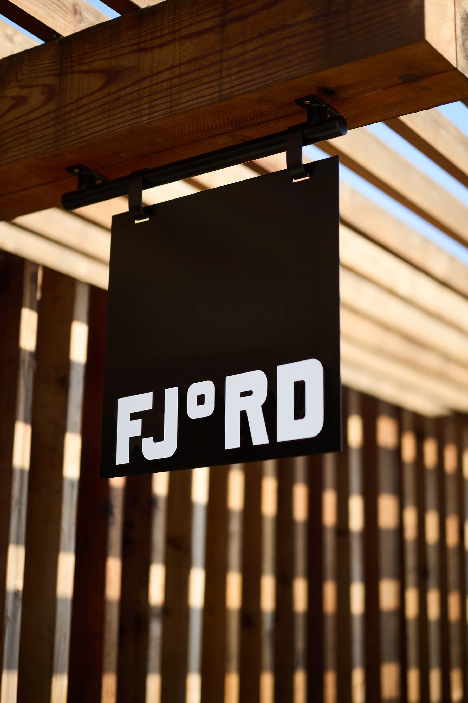
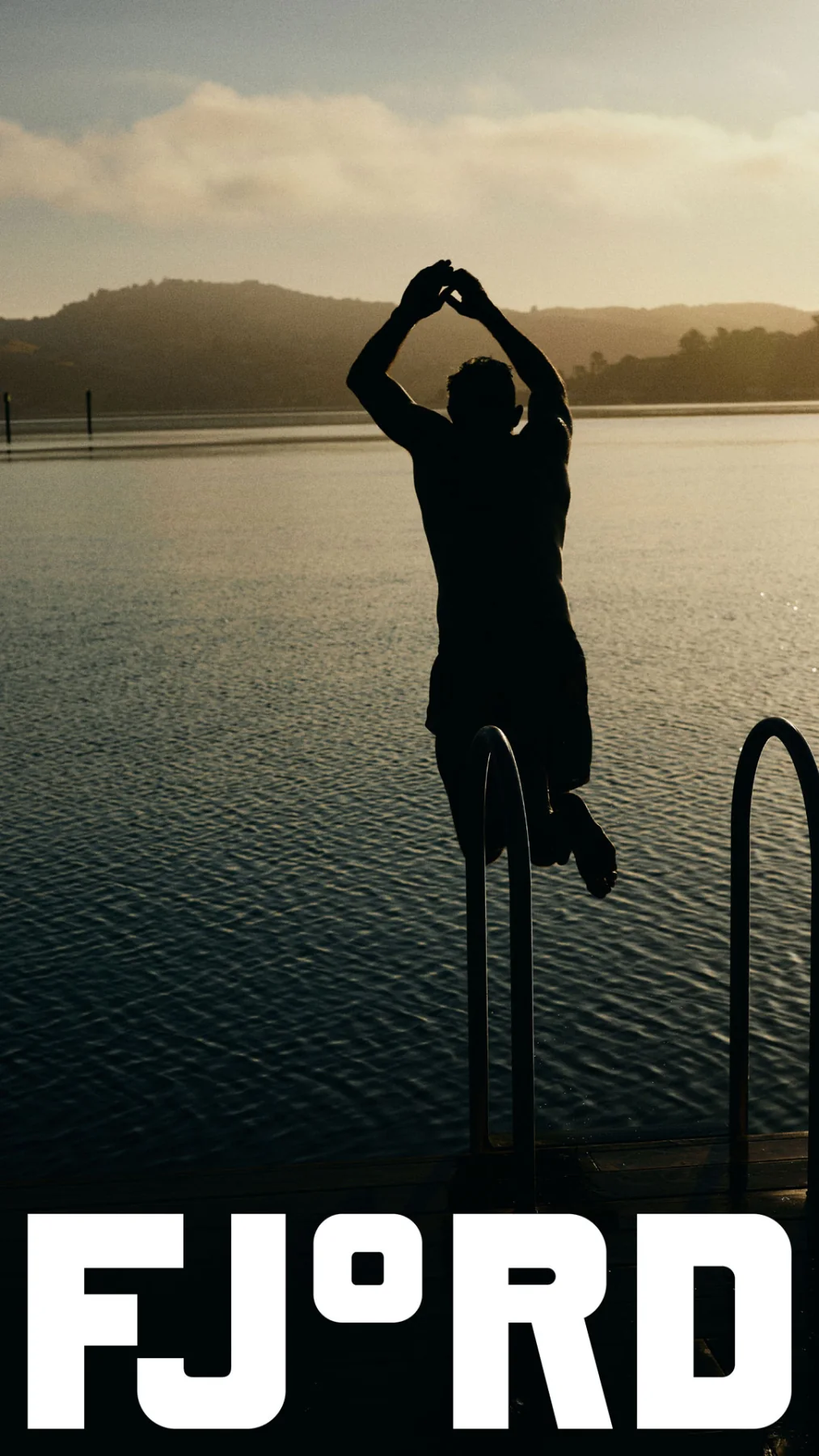
字标是 FJ°RD,字母 O 被换成了一个度数符号。桑拿靠的是温差:将近 90 摄氏度的木屋,和十几度的海水。把这个符号放进名字,品牌名就像一块读数,读到名字就知道它是干什么的。
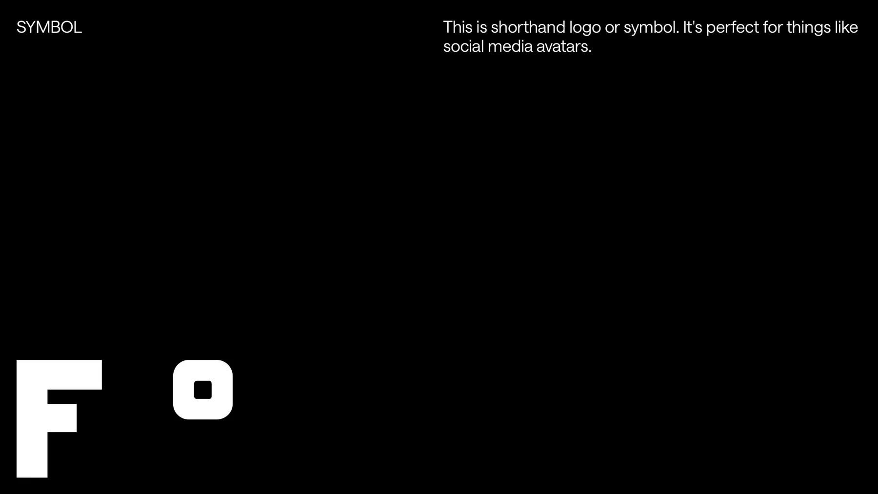
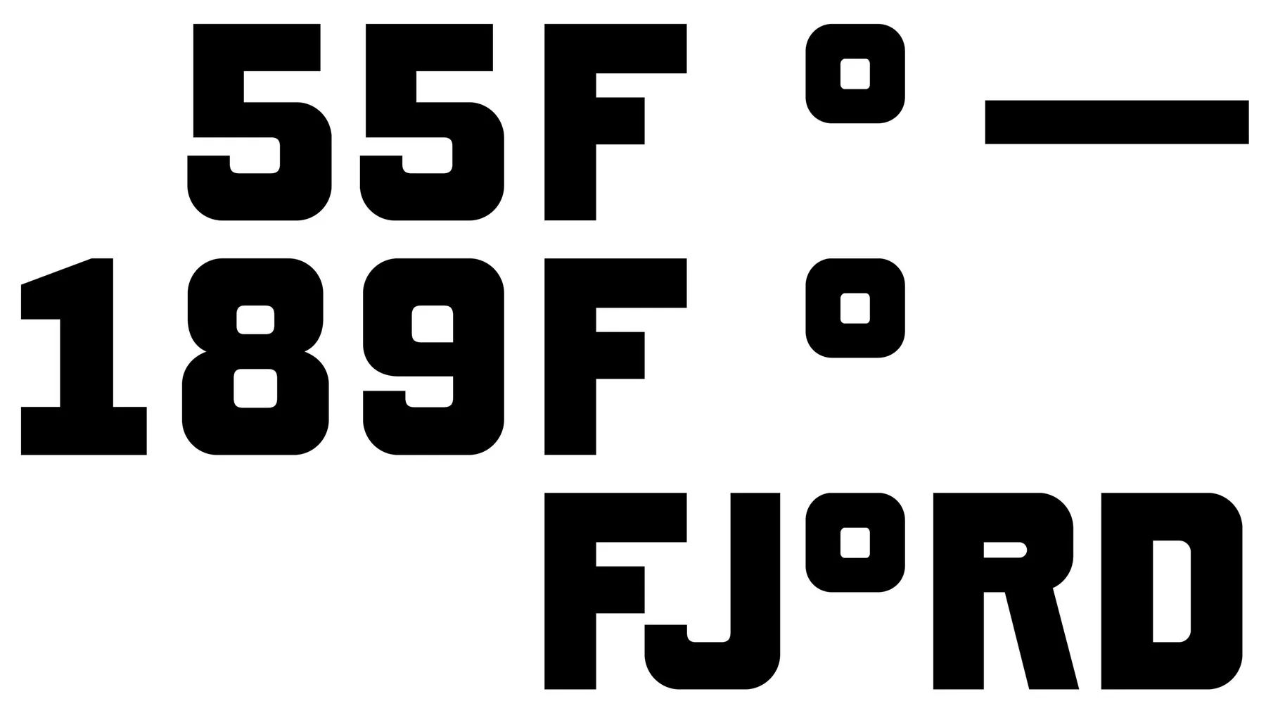
这个替换也很实用。度数符号单独拿出来就是一个图形,和 F 组成 F°,用在社交媒体头像和招牌上;在海报里,它又能接在任何数字后面。一个符号同时是字母、图形和单位,DutchScot 找到的这个点子很小,但能撑起一整套系统。
Design DutchScot · 摄影 Alex Farnum · DutchScot
Design DutchScot · 摄影 Alex Farnum · DutchScot

Design DutchScot · 摄影 Alex Farnum · DutchScot
Design DutchScot · 摄影 Alex Farnum · DutchScot
DutchScot
船厂气质的字
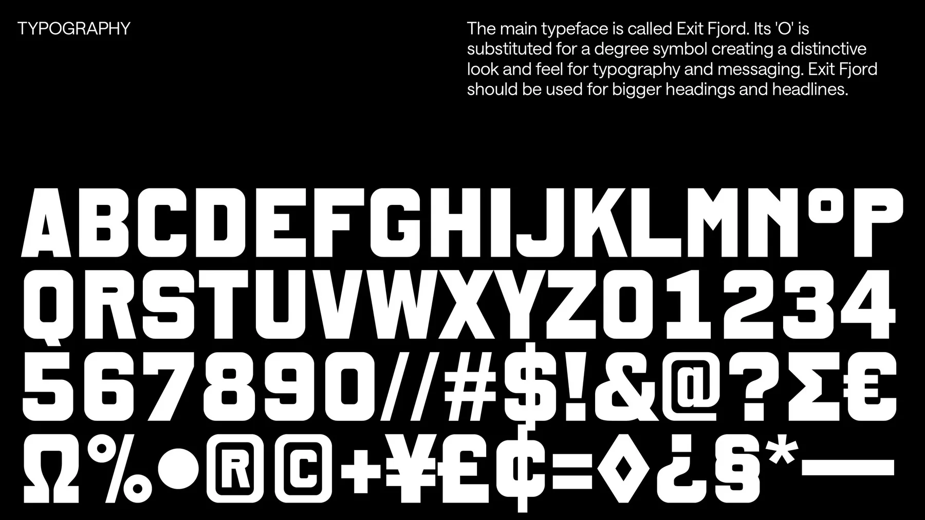
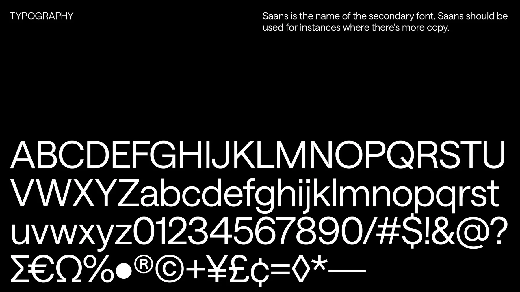
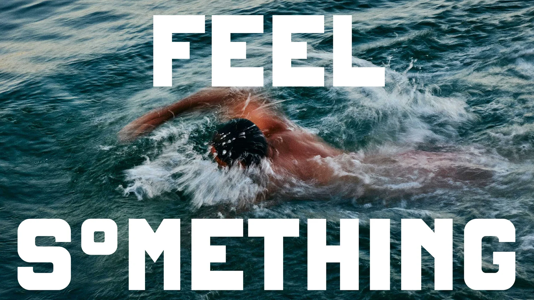
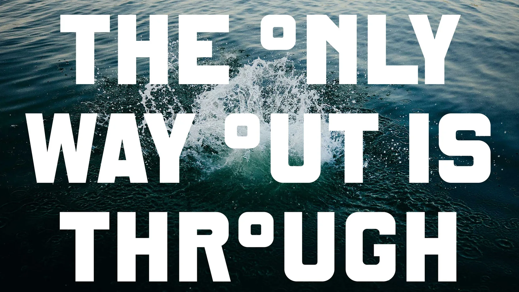
主字体 Exit Fjord 是和丹麦字体公司 Playtype 合作定制的,字形方中带圆,笔画很粗,像冲压在钢板上的字。字库里的 O 全部换成了度数符号,所以标题和标语里的每个 O 都会变成小方块,品牌的口气渗进了所有文字。长段落改用 Saans,字形安静,读起来不累。
粗重的方块字配上了圆角,保留了工业感,又有一点像旧时的木刻招牌,和桑拿房的木头放在一起不违和。创始人说这里「不是水疗馆」,粗硬的招牌字也在替他说这句话:这里卖的是热、冷和出汗。
Design DutchScot · 摄影 Alex Farnum · DutchScot
Design DutchScot · 摄影 Alex Farnum · DutchScot
Design DutchScot · 摄影 Alex Farnum · DutchScot

Design DutchScot · 摄影 Alex Farnum · DutchScot
189°F 和 55°F
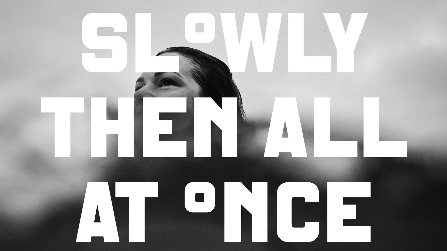
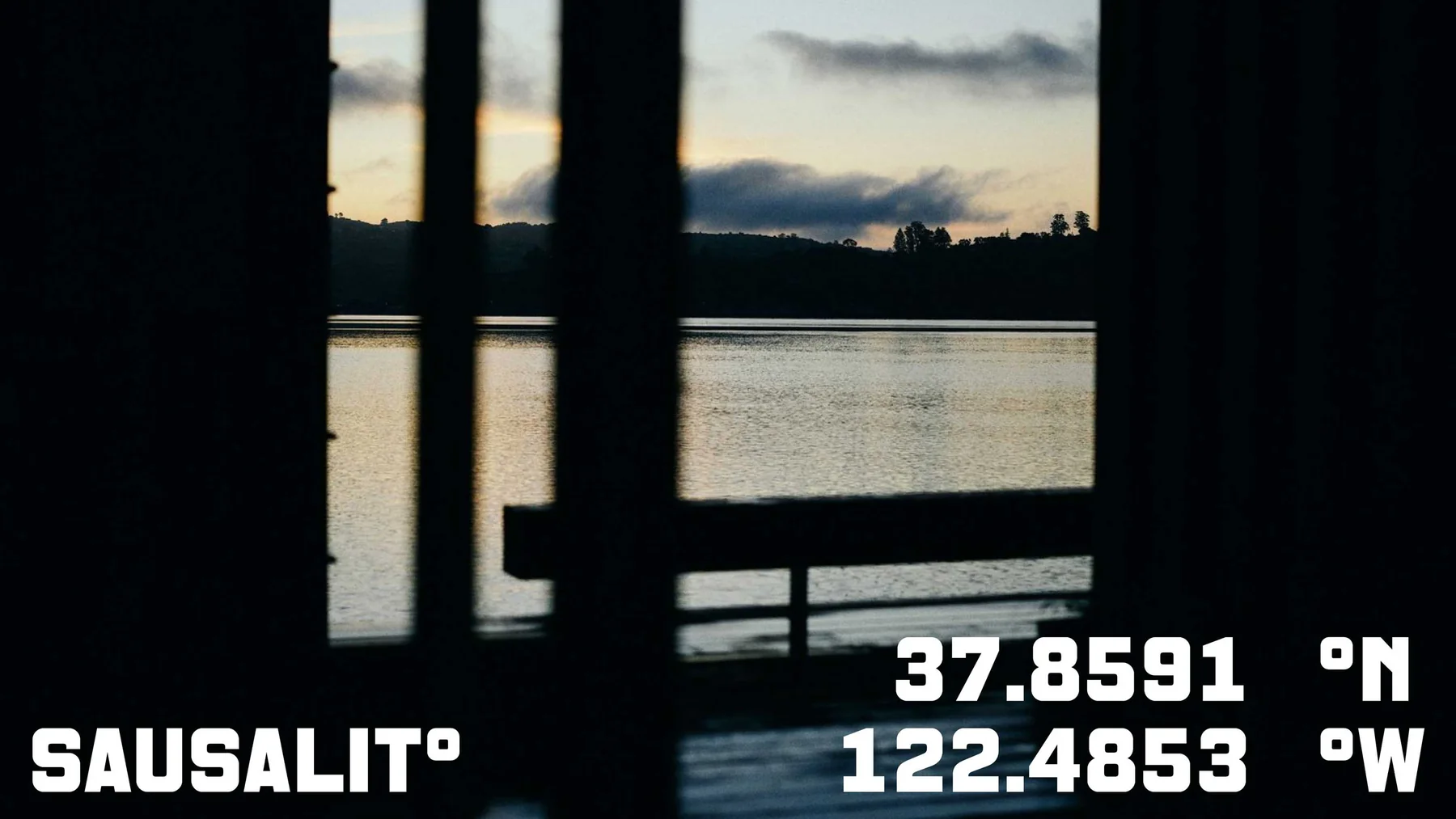
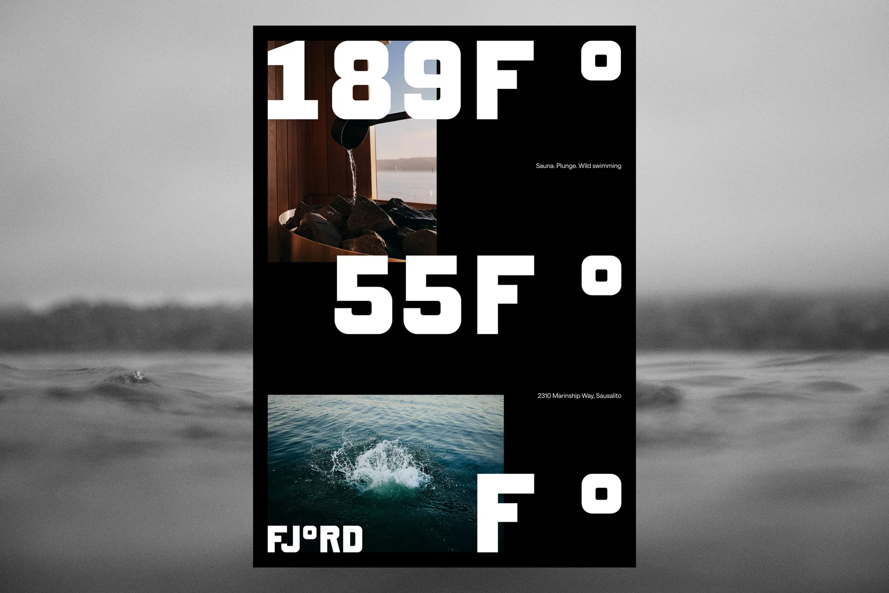
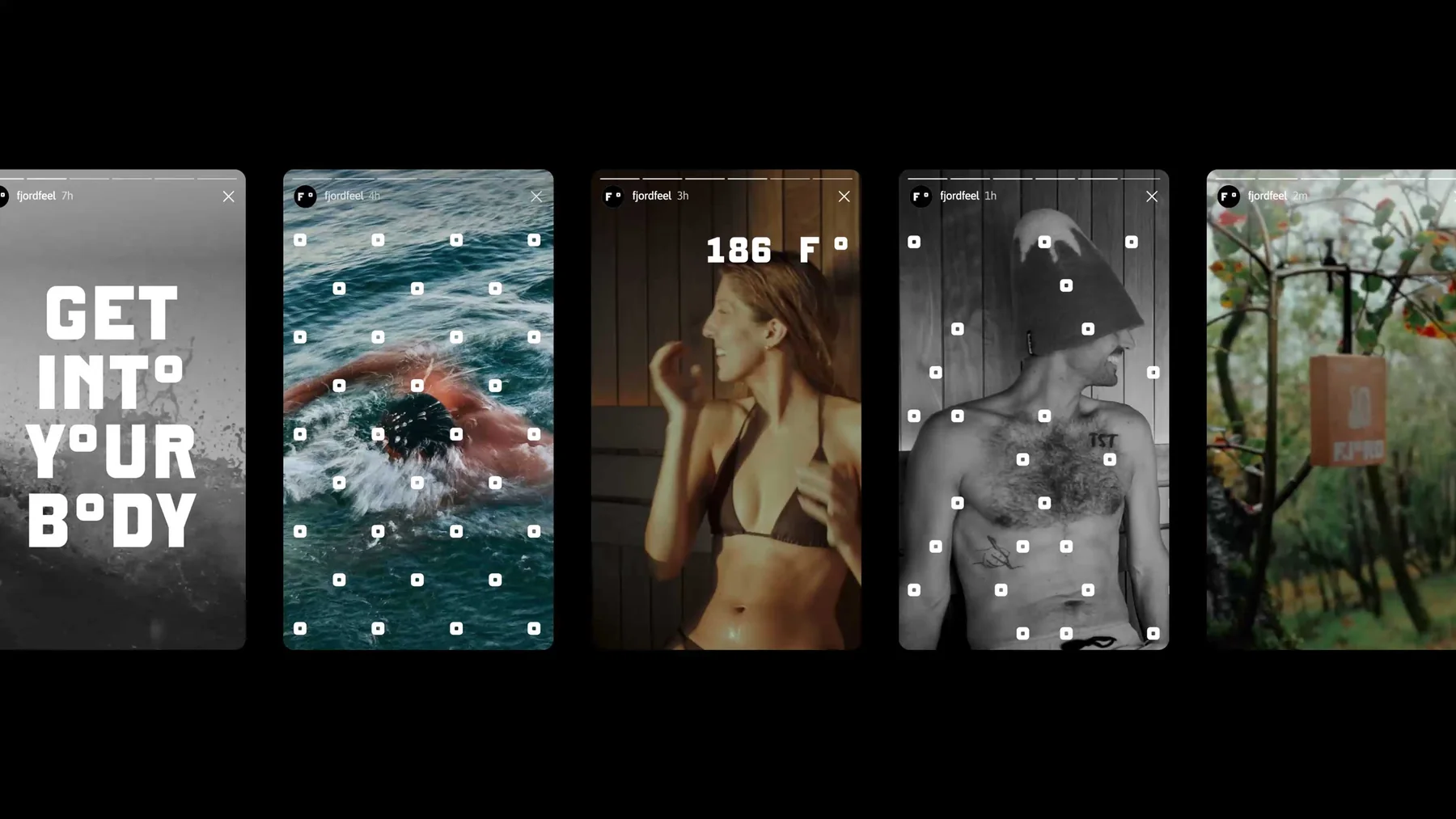
海报直接用数字说话:桑拿 189°F,海湾的水 55°F,小镇名也被改写成 SAUNALITO。标语都短,Slowly then all at once,Get into your body,没有一句在许诺放松,说的都是身体在冷热之间的那一下冲击。
Design DutchScot · 摄影 Alex Farnum · DutchScot
Design DutchScot · 摄影 Alex Farnum · DutchScot
Design DutchScot · 摄影 Alex Farnum · DutchScot

Design DutchScot · 摄影 Alex Farnum · DutchScot
Design DutchScot · 摄影 Alex Farnum · DutchScot
Design DutchScot · 摄影 Alex Farnum · DutchScot
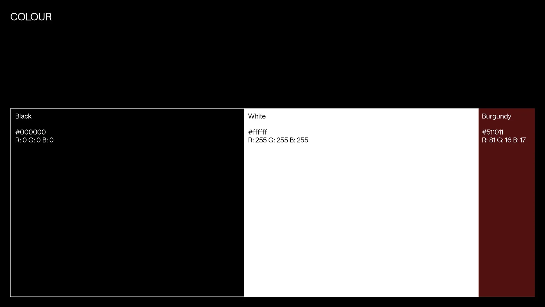
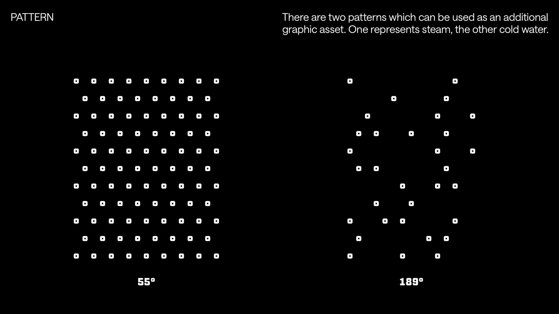
颜色只有黑、白和一块深红。两种辅助图案用一排排小方点组成,一种代表蒸汽,一种代表冷水,正好对应度数符号的形状。整套系统的元素很少,都从那个度数符号推出来,所以只用黑、白和一块深红也撑得住。
Design DutchScot · 摄影 Alex Farnum · DutchScot
Design DutchScot · 摄影 Alex Farnum · DutchScot
Design DutchScot · 摄影 Alex Farnum · DutchScot
Design DutchScot · 摄影 Alex Farnum · DutchScot
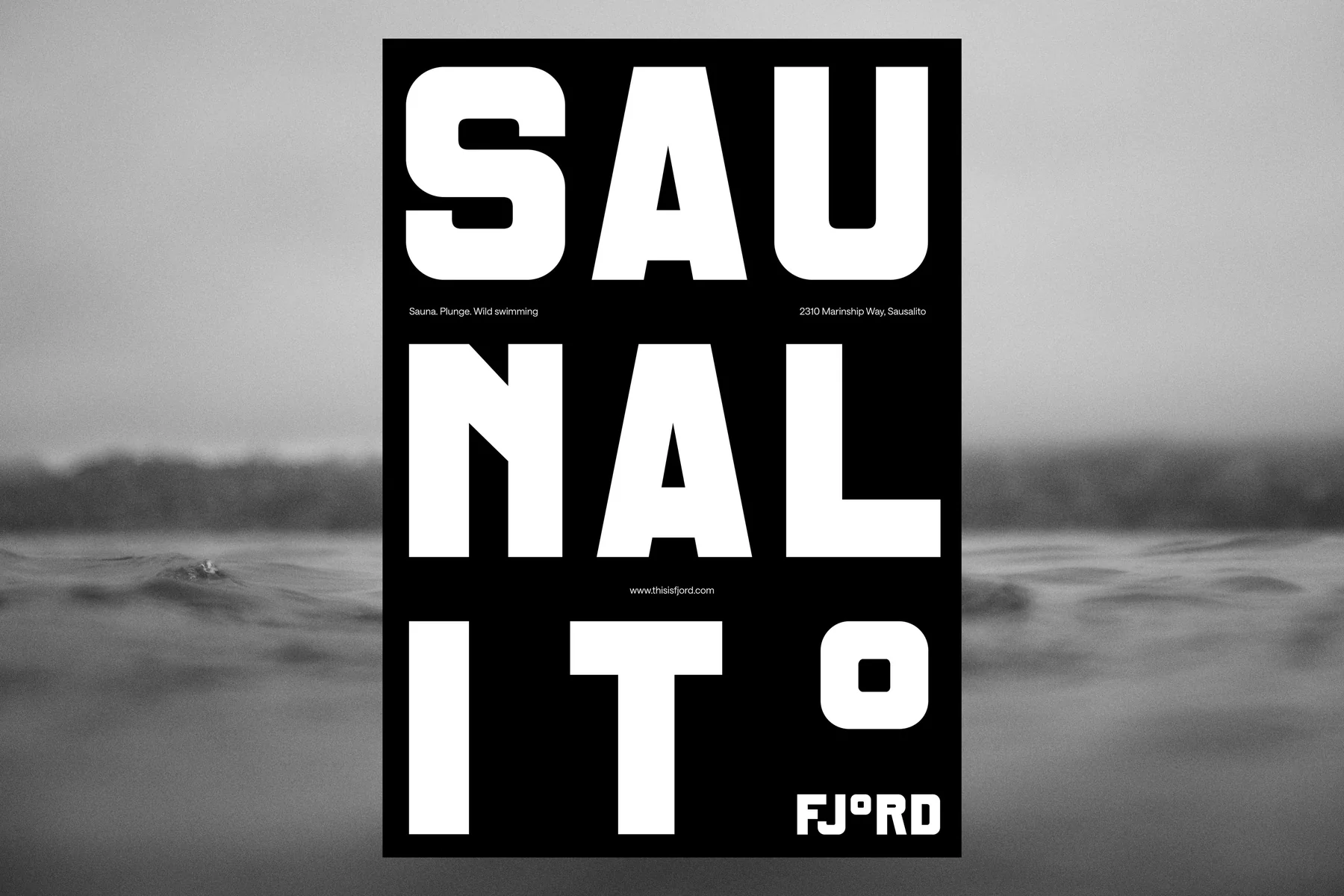
Design DutchScot · 摄影 Alex Farnum · DutchScot
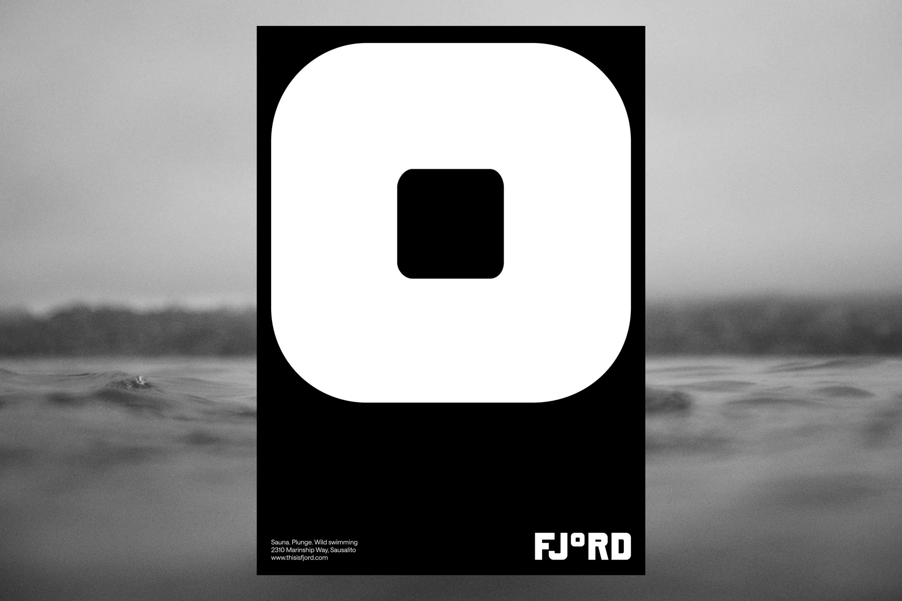
Design DutchScot · 摄影 Alex Farnum · DutchScot
黑白里的海湾
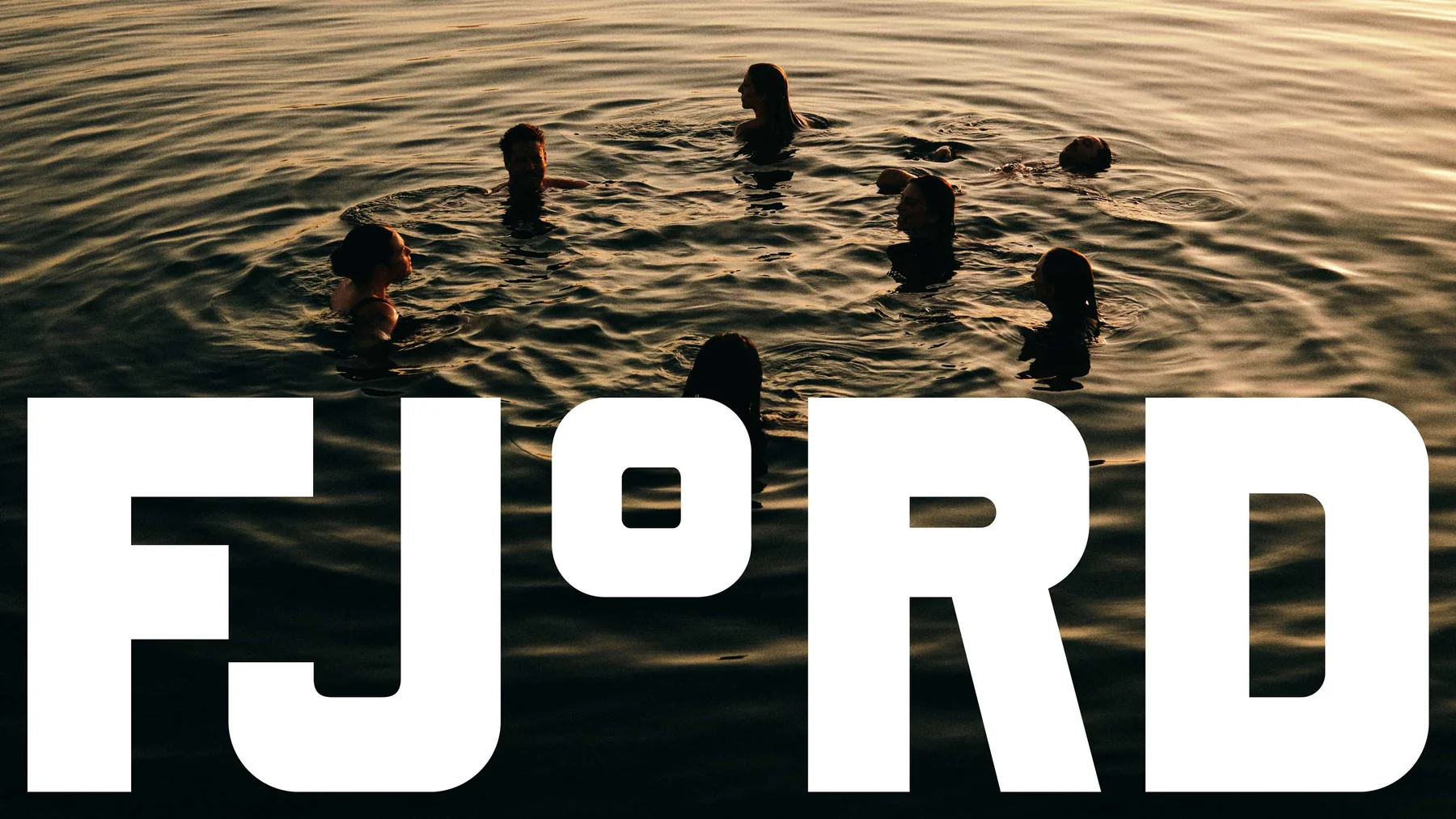
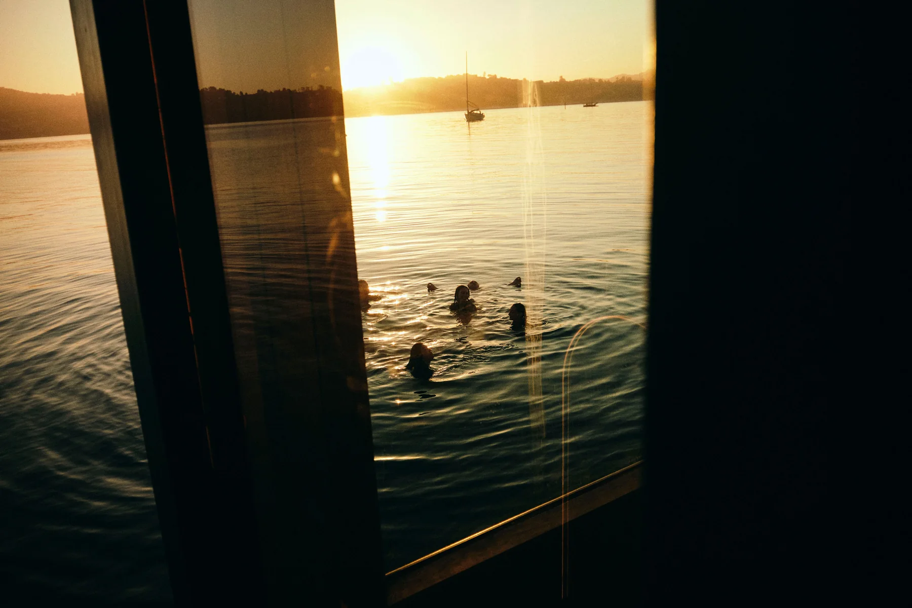
Alex Farnum 拍的照片大多是黑白,或者被压暗的清晨和傍晚,人在照片里常常很小,海湾占大部分画面。这和 Fjord 的定位一致:主角是那片冷水和一起下水的人。
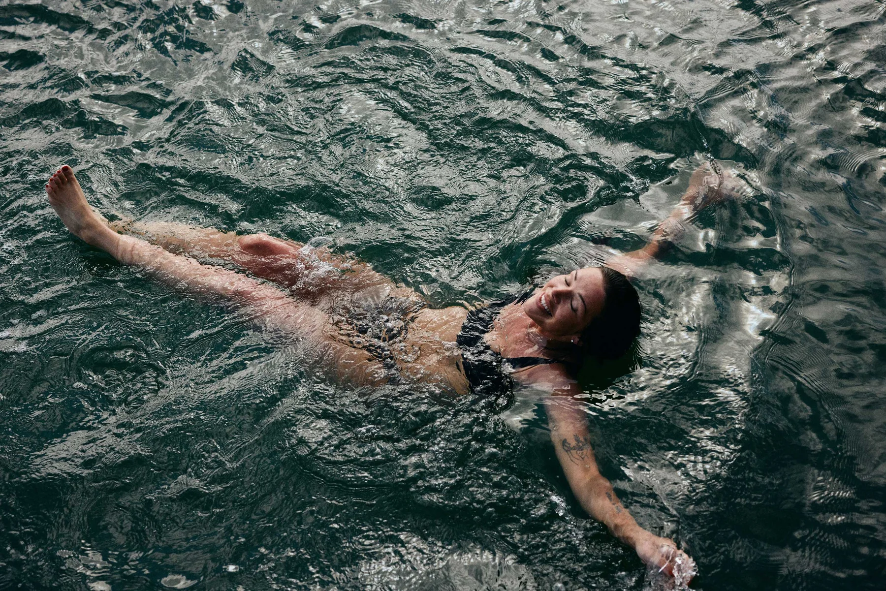
Design DutchScot · 摄影 Alex Farnum · DutchScot
照片也只用黑白,和字体一样粗硬。高反差的照片,压上粗白的 Exit Fjord,整套东西读起来像一份老港口的告示。
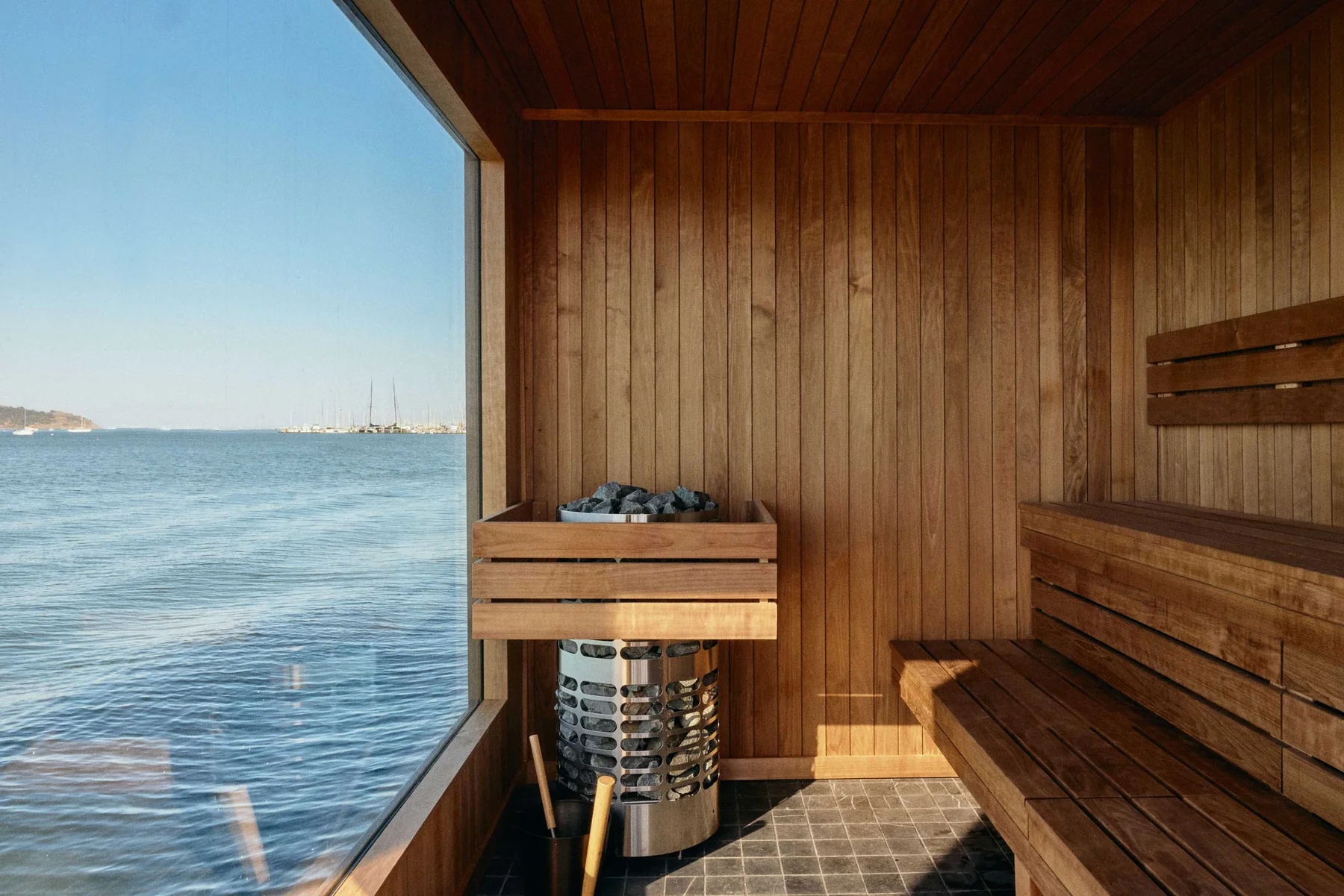
Design DutchScot · 摄影 Alex Farnum · DutchScot

Design DutchScot · 摄影 Alex Farnum · DutchScot
Design DutchScot · 摄影 Alex Farnum · DutchScot

Design DutchScot · 摄影 Alex Farnum · DutchScot
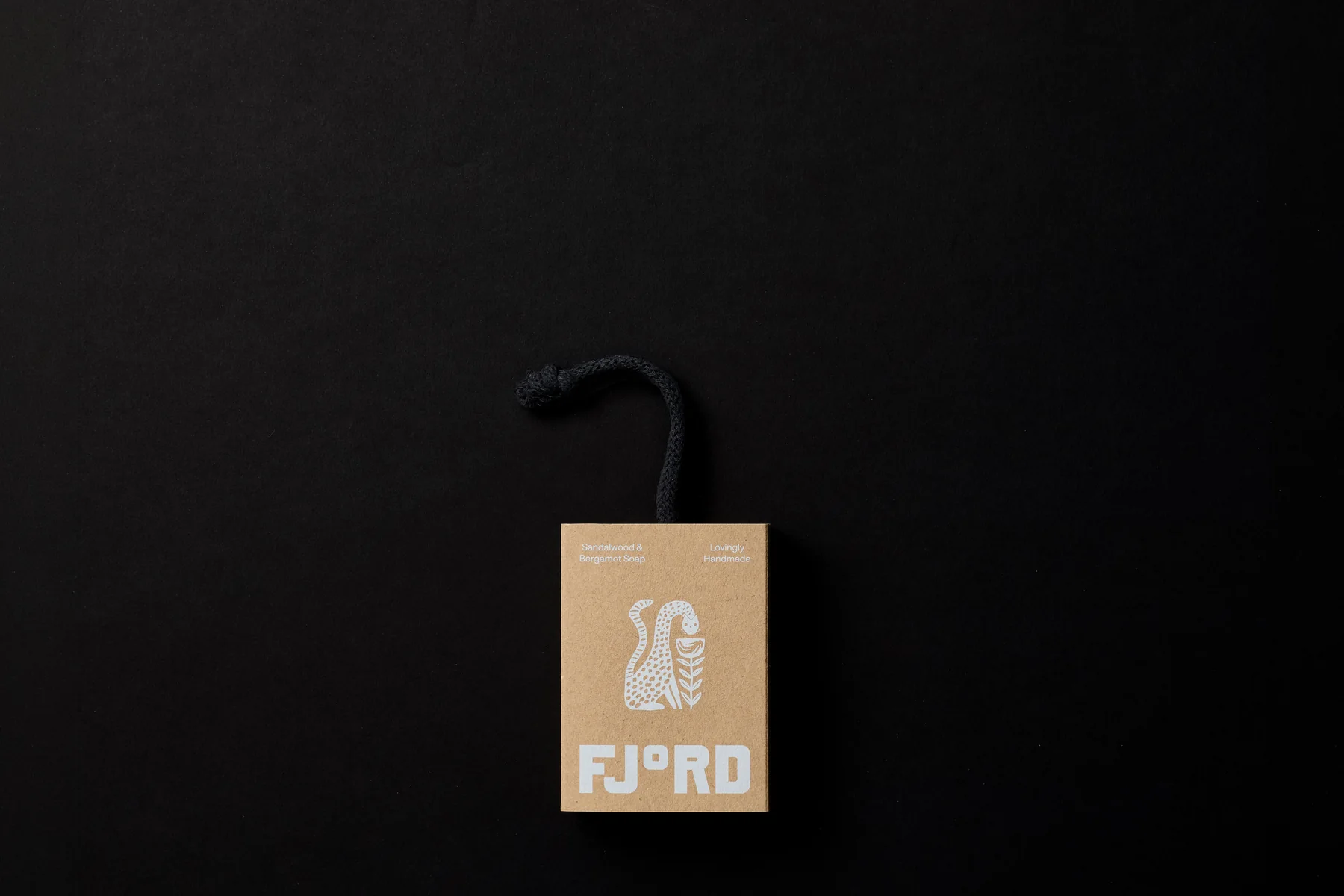
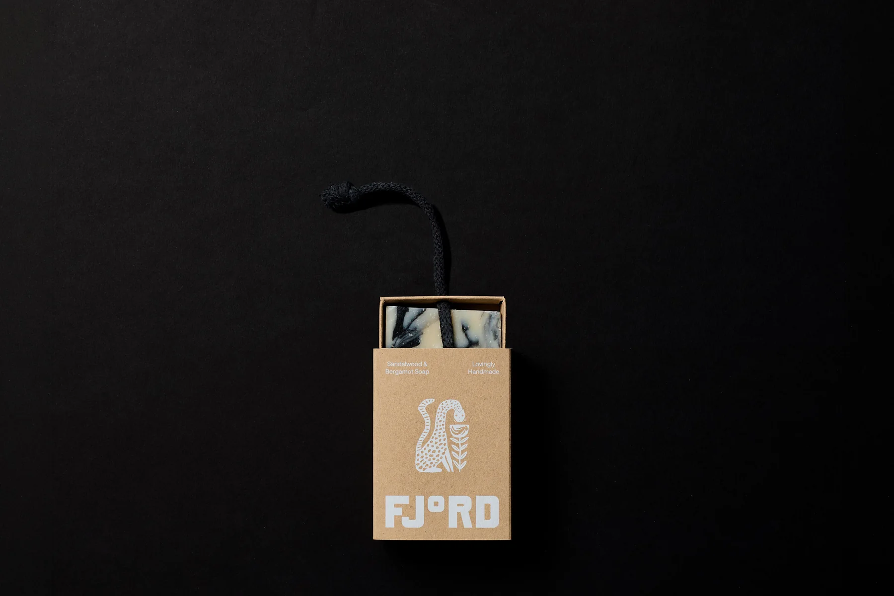
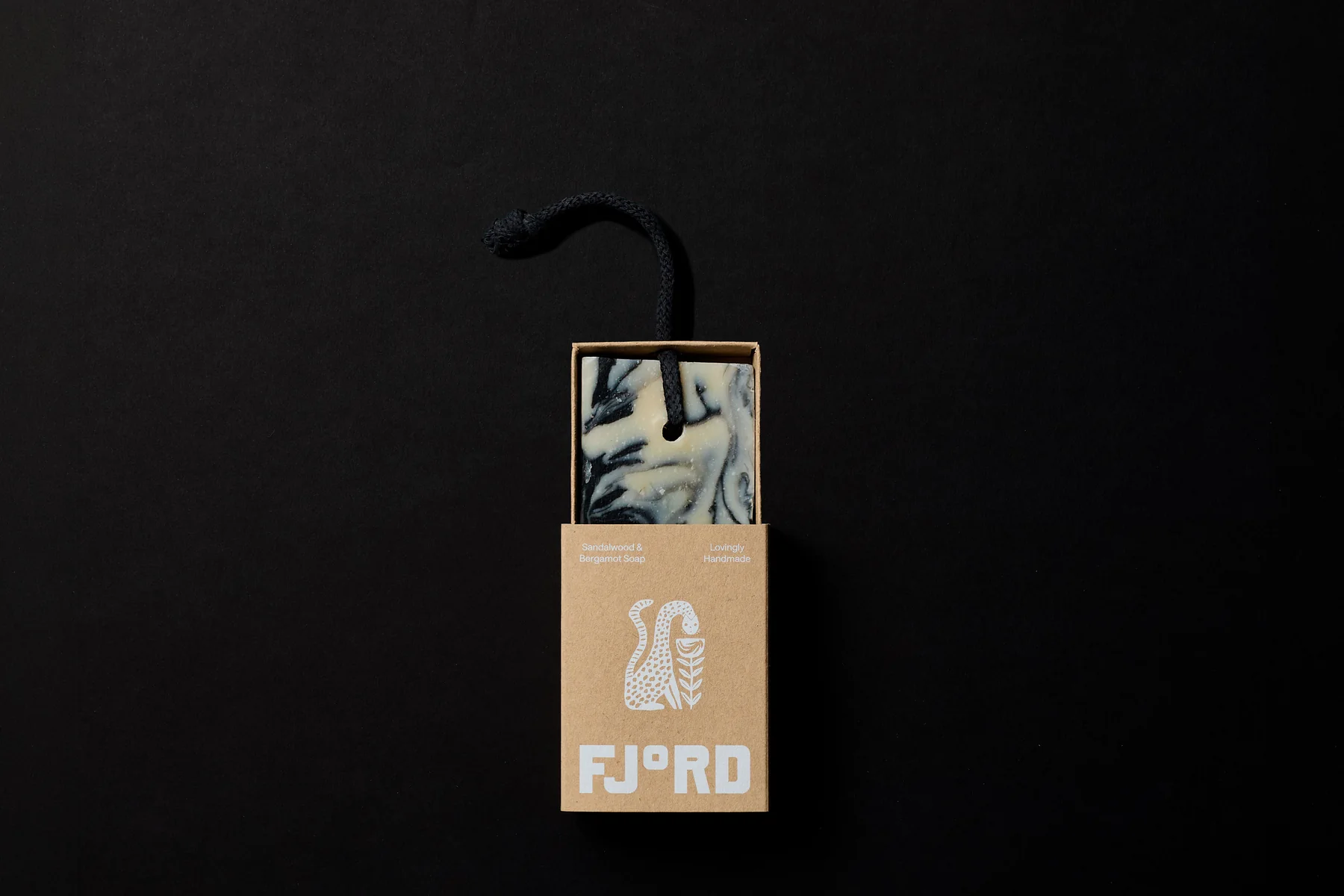
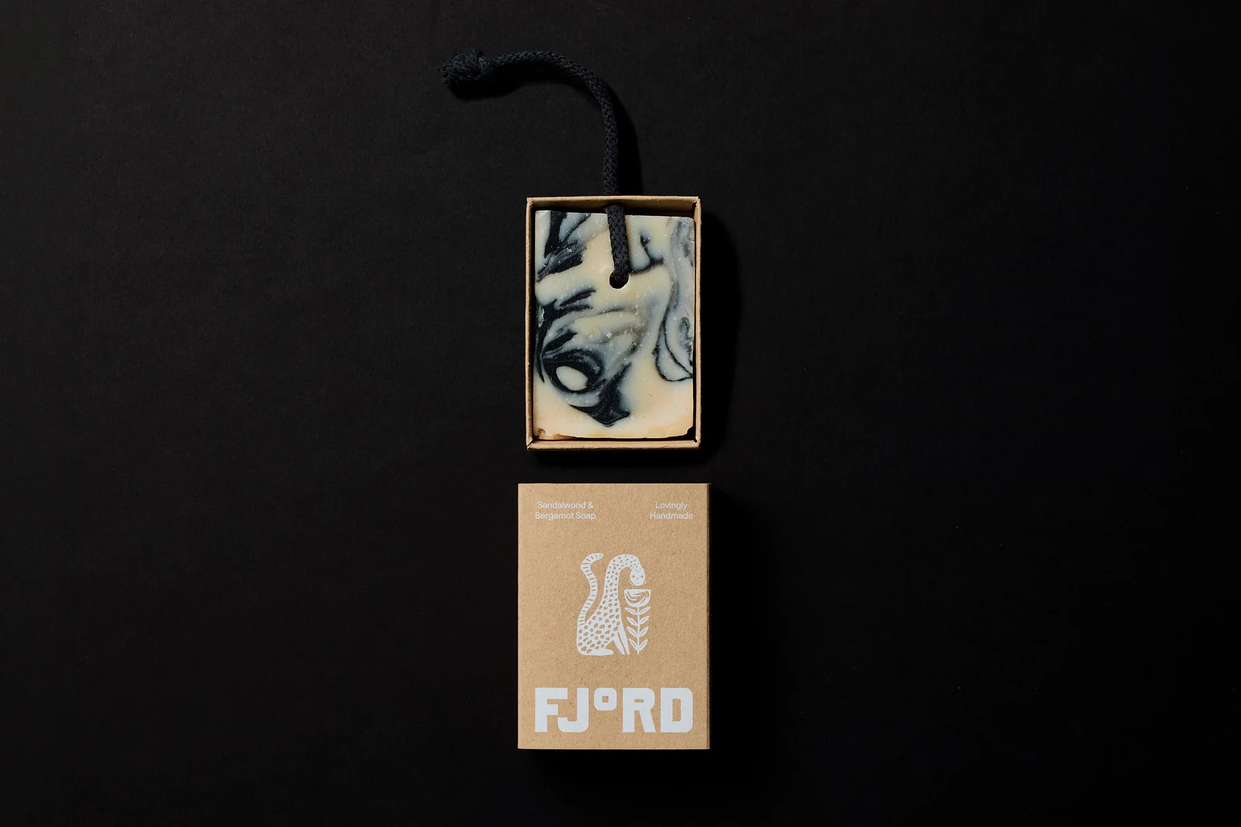
礼品券换成一块会带进桑拿房的肥皂
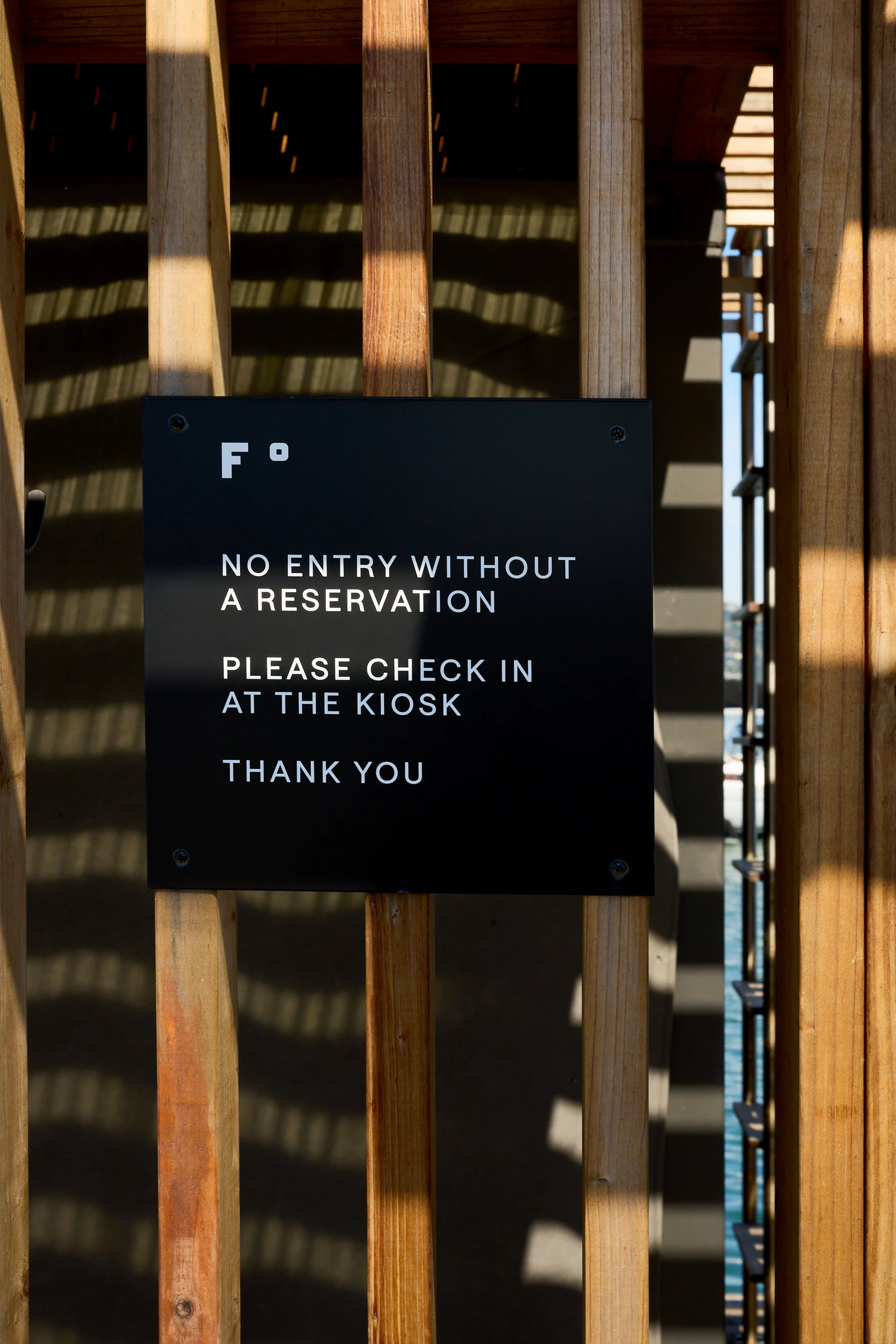
招牌是挂在木栅栏上的黑色金属板,只写 FJ°RD 和必要的指示,木头的暖和铁板的硬放在一起,工业感没有吞掉场地本身。
Design DutchScot · 摄影 Alex Farnum · DutchScot
Design DutchScot · 摄影 Alex Farnum · DutchScot
Design DutchScot · 摄影 Alex Farnum · DutchScot
DutchScot
DutchScot
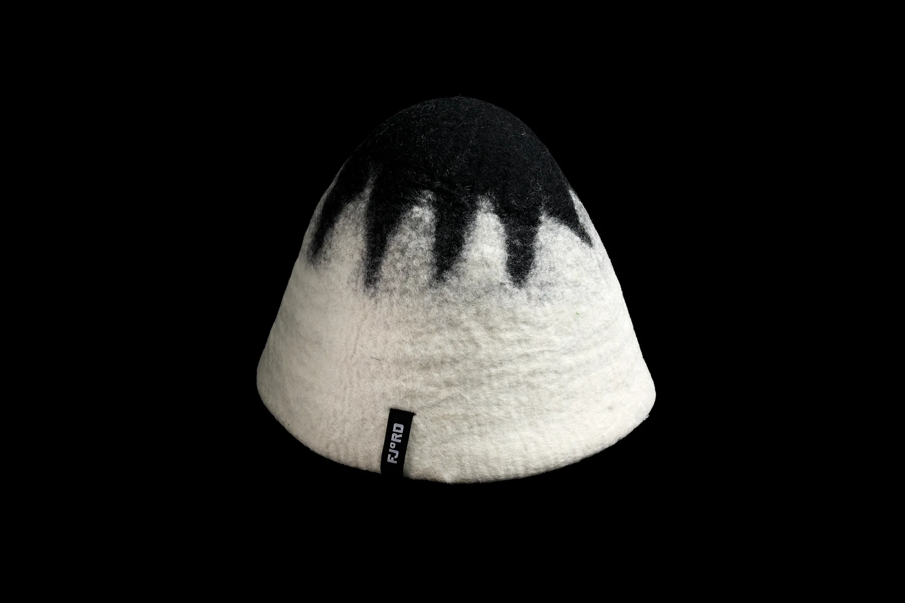
网站上有一根随滚动上下移动的「温度计」,导航刻度也像温度计上的刻线。礼品券没有做成塑料卡或者电子码,换成了一块装在定制纸盒里的手工肥皂,收礼的人拿到的是一件真的会在桑拿房里用上的东西,这件礼物会一直提醒他去一趟。
Fjord 把「不是水疗馆」这句定位落到了很具体的地方:名字里的度数、船厂气质的字、黑白的海湾,还有一块会被带进桑拿房的肥皂。这些东西单看都简单,放在一起,看起来就是给想去冷水里泡一泡的人准备的。
Design DutchScot · 摄影 Alex Farnum · DutchScot
Design DutchScot · 摄影 Alex Farnum · DutchScot
项目信息
委托方:Fjord(创始人 Alex、Gabe)。品牌识别、印刷品、网站、周边与导视:DutchScot。定制字体:DutchScot 与 Playtype 合作。辅助字体:Saans。摄影:Alex Farnum。